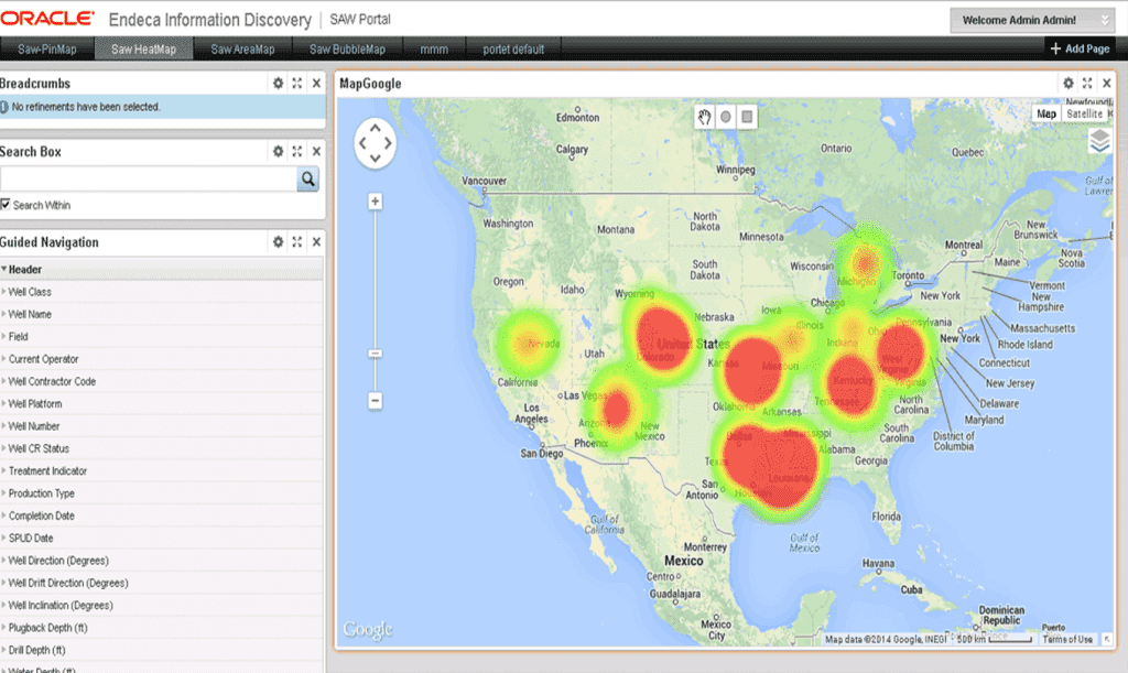
Data Visualization for a US oil field services company
A leading oil field services company in USA wanted to leverage their big data system to effectively plan and manage their production and sales cycles. They required major enhancments to their existing data portlet in Oracle Endeca portal to display 5000 records at a time in Pin, Bubble and Heat Maps along with Configuration screen changes.
Objectives
- Ability to view huge amounts of data, mix and match in a visual-way
- Predefined architecture to leverage existing investments
- Meet response time criteria for various data loads visualization
- Enhance look and feel and flexibility to customize end-user view
Solution
- Collaborate with customer to create User Stories
- Propose Architectural changes with minimal cost impact to overcome architecture limitations
- Agile sprints, milestone based periodic review and backlog updates to all stake-holders
- Improve page load-time from 6 mins to 12 seconds in lab environment
Post has no taxonomies
